


Get Early Access
.svg)
How Slack Nails User Onboarding (and How You Can, Too)
Have you ever been through Slack onboarding? If you’ve then you just know that they have it spot on. Slack shortens time-to-value by designing the first 10 minutes around one outcome. In this case study, we break down the moments that matter in Slack’s onboarding and show exactly how to implement the same playbook in your PLG SaaS.
.png)
The Challenge: First Sessions Are Quiet
Most PLG trials start with curiosity and end with silence. People sign up, skim the UI, and bounce before they ever experience real value. Why?
The moment someone lands in your product, the clock starts - no one wants long docs or steep learning curves. Your job is to crush time-to-value (TTV): get them to a meaningful outcome fast.
Slack’s answer was not “more education.” It was less friction and timely nudges that let value happen inside the product fast.
What Slack Does Differently?
1) Friction-lite sign-up
A single email field (or Google sign-in) gets you in. Passwords/verifications are deferred until they’re truly needed. The goal: minutes to first message, not minutes in a form.

Takeaway: Ask only for what unlocks value now; everything else can wait. If you don’t need something in the user's first session, then don’t ask. TTV is very critical.
2) Personalization in the First 60 Seconds
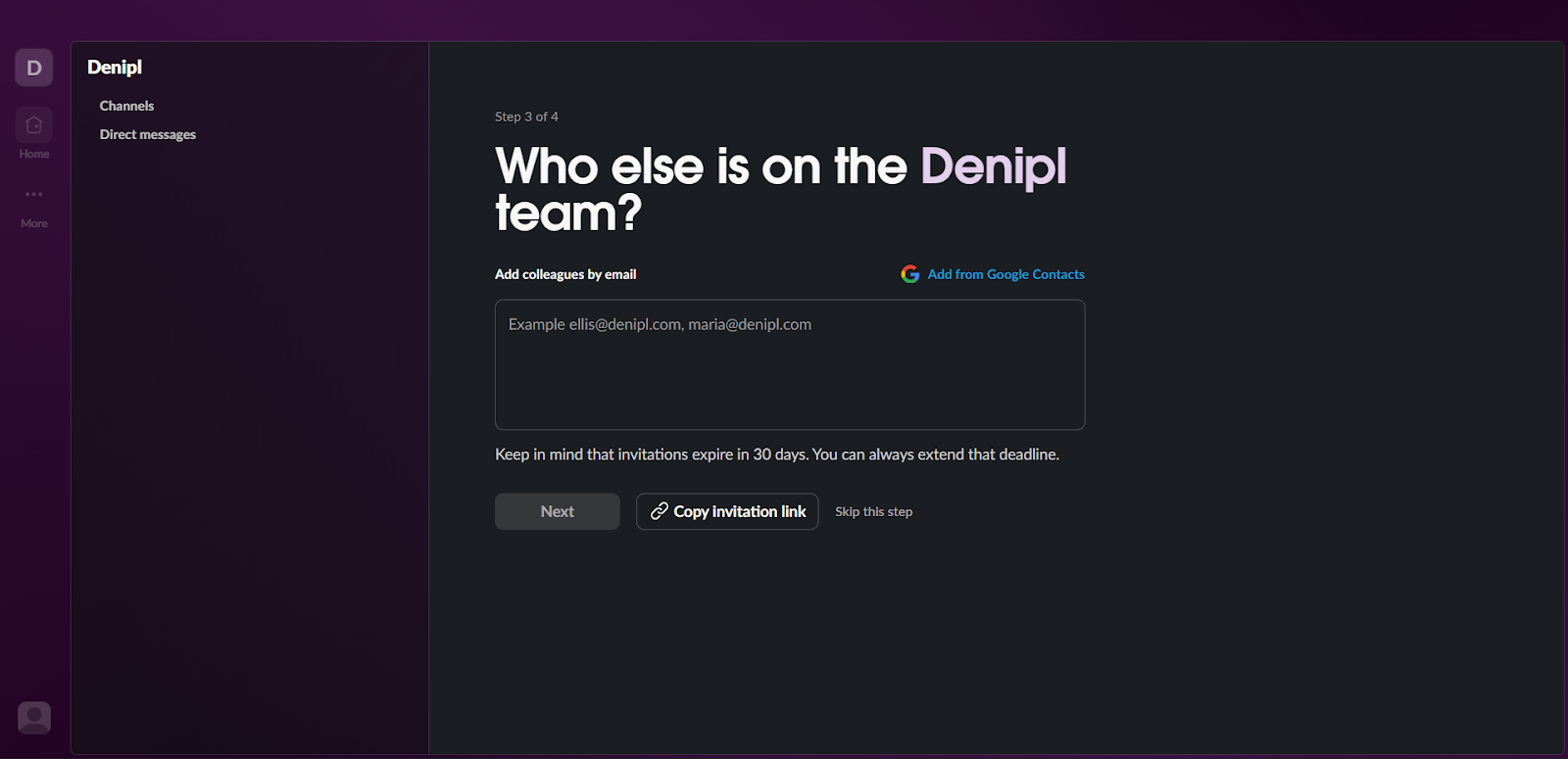
Slack asks two or three intent questions, then reflects the answers back immediately: your workspace name and a pre-named first channel.

Slack asks to invite your team members in their onboarding, which gets them more user signups and gets the users one step closer towards the activation point.
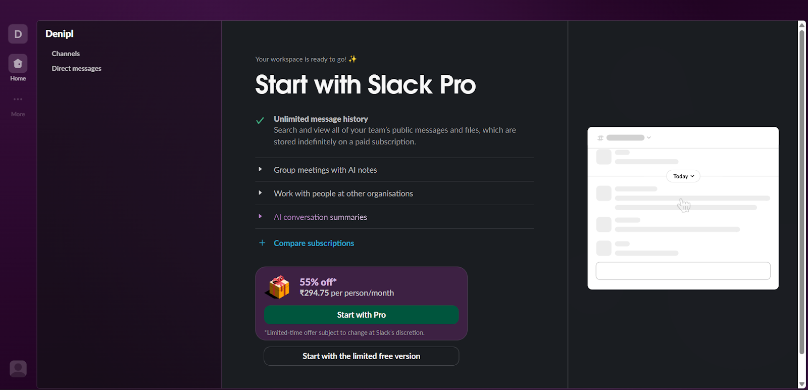
Slack gives users a sense of what happens if someone subscribes to their paid plan and a cheeky offer to lure them towards subscribing
Takeaway: Mirror user inputs in the UI immediately - names, defaults, sample content. Ask questions that help you take the user one step closer to the value of the product.
3) Action Over Exposition
Instead of a 12-step tour, Slack puts focus in the message box with a hint. Hit enter, get a small celebration, move forward.
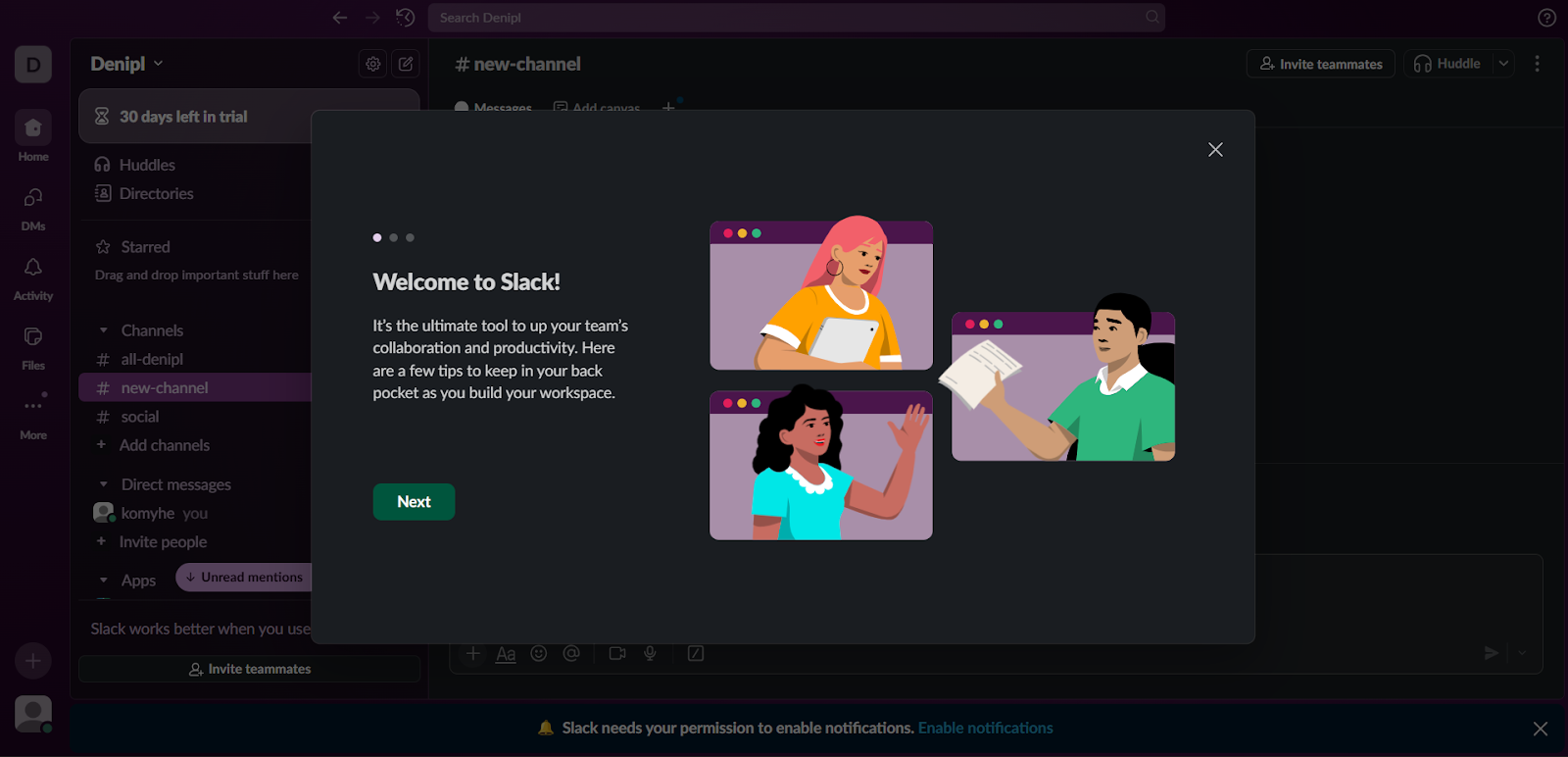
Takeaway: Make the next action the default focus. Celebrate the click that matters.
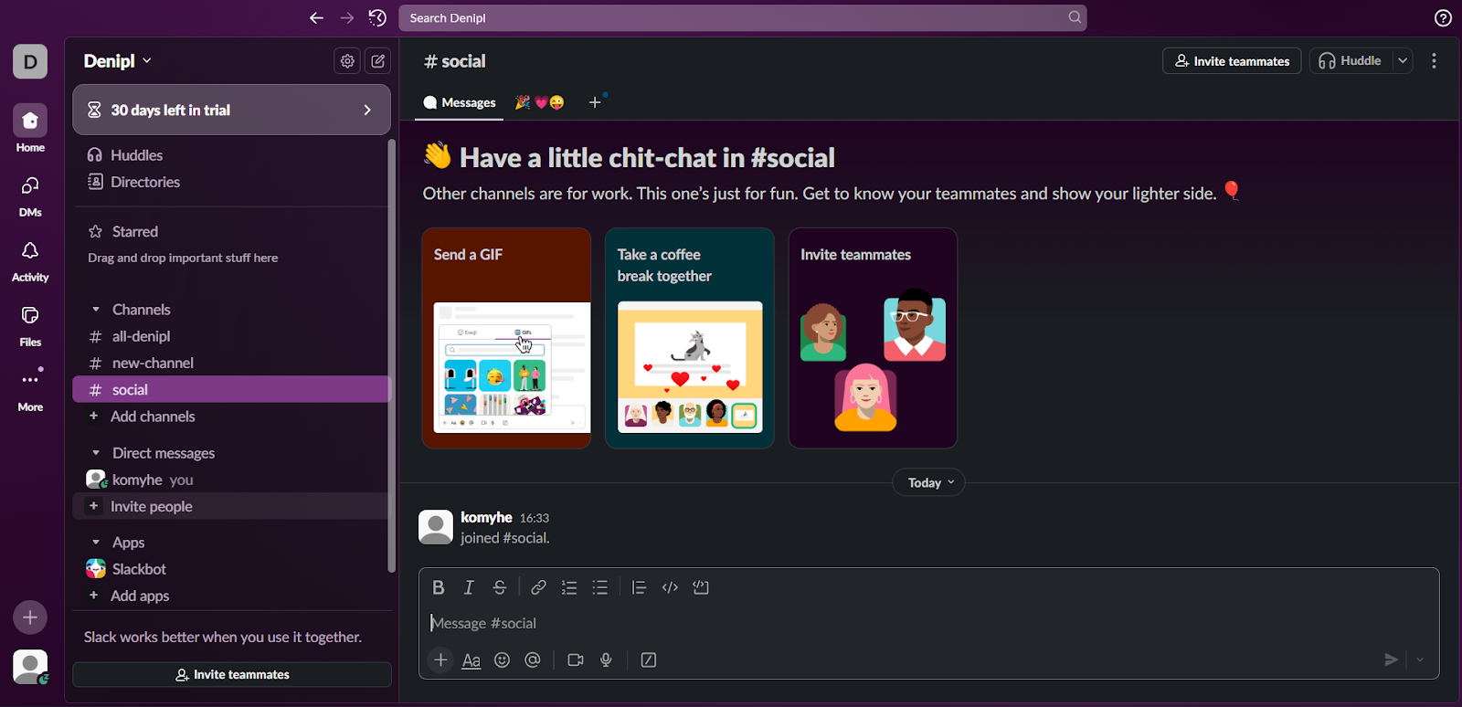
4) Empty States That Teaches
Blank surfaces explain “what this space is for” and suggest a single next step. No walls of text and no lecture.

Takeaway: Every empty state/screen should answer: Why am I here? What should I do now?
5) Teaching With Onboarding
Onboarding inside Slack is super easy with tool tips, templates, and nudges they provide. This beats some detached docs, which pop up with a long paragraph every time.
Takeaway: Teach in the product, in context, with the same UI users will use tomorrow.
If you want to learn more about Slack’s world class onboarding then here is the onboarding teardown.
How to Implement This in Your Product?
You don’t need Slack’s headcount to do this. You need a clean and clear onboarding model that makes the users reach that aha moment fast and actually helps them to understand your product.
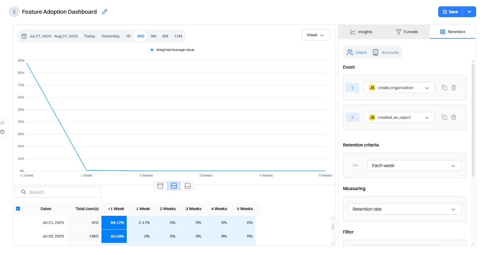
Step 1: Define activation and key user events
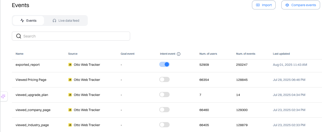
Identify what that activation point is, or what's the point when the user will get the first value out of your product, and map events guiding them to that value and beyond. Track the minimum set:
- workspace_created, first_message_sent, channel_created, member_invited
- integration_added (capture provider), workflow_run (if you have automations)
- Stall signals: no_activity_12h, no_invites_24h, checklist_dismissed
Use Intempt to track key user events with your product or even with your website.
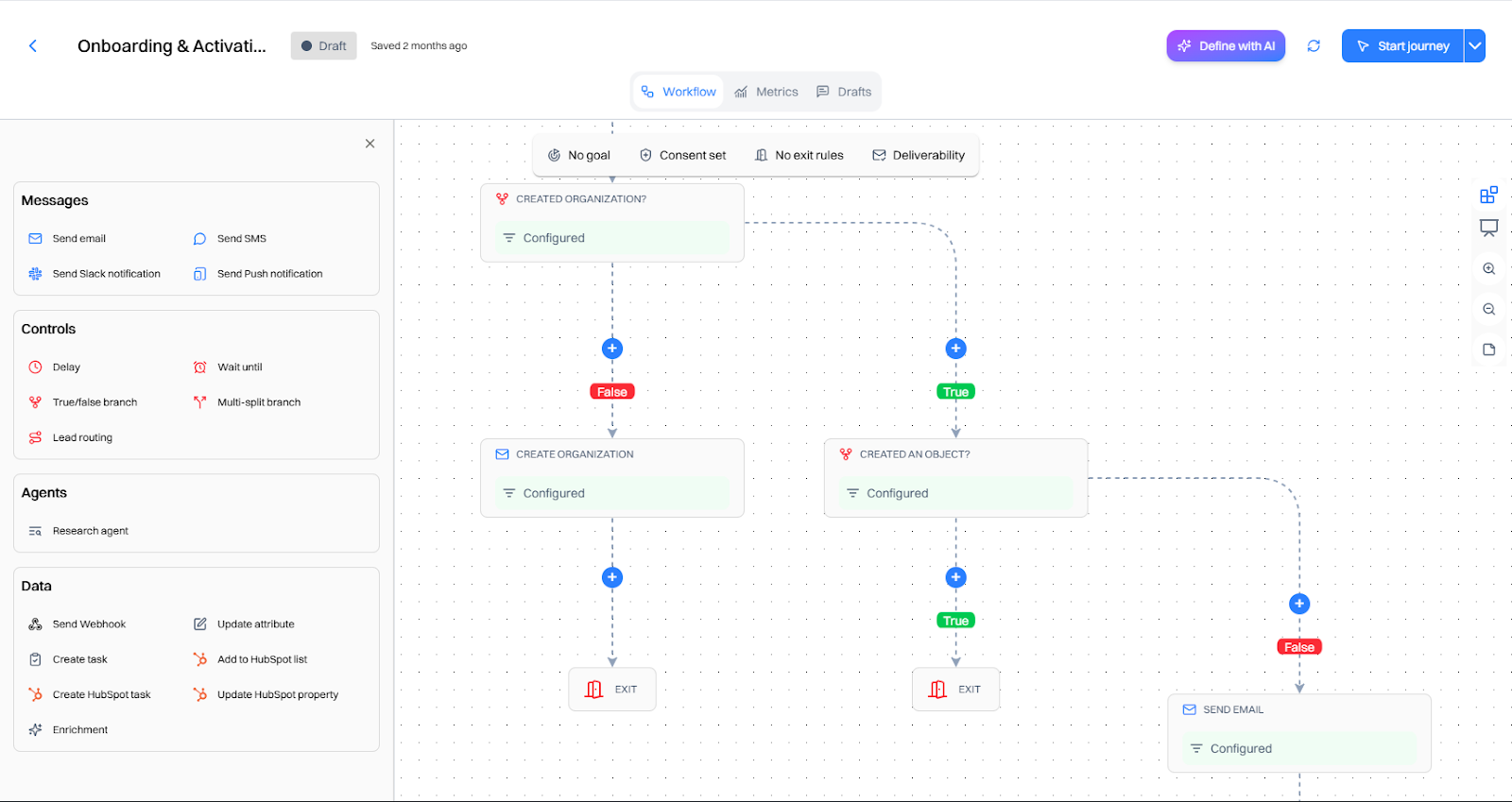
Step 2: Build a next-best-action map
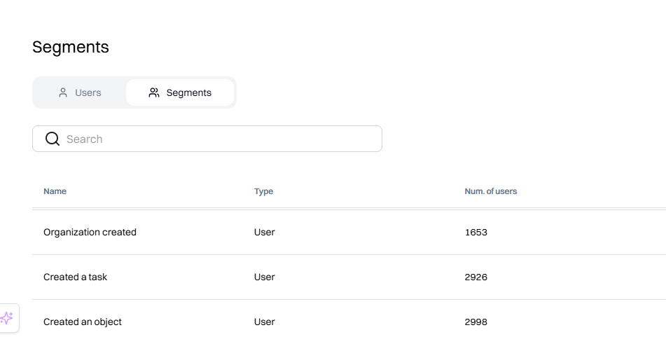
For users to get the best out of the product, you should map out key actions they should take to reach that aha moment fast. Lay out these user journeys and make proper segments inside of users inside Intempt who have done the action to guide them to the next step.
Intempt updates these segments in real time, so after a user does an event, they automatically get enrolled in these segments.
- New User: Users who have just signed up. Created Project:
- Users who have created their first project.
- Created Task: Users who have created and edited their first task.
- Invited Team Member: Users who have invited their first team member.
Step 3: Render server-side personalizations
First sessions collapse when the UI feels generic or jumpy. Intempt Server-side personalizations rendering avoids “flicker” and makes guidance feel native.
Some personalized user onboarding you can do:
- Pin a 3-5 step checklist (message → channel → invite → integration → optional workflow)
- Add micro-banners in empty states (“This channel is for X. Try Y.”)
- Drop CTA tiles that match the NBA prediction
- Trigger Slackbot-style inline help where users already type/click
Every element should have a skip option and respect frequency caps.
Step 4: Extend gently to other channels
If users stall in-app, a light nudge outside the product can restart momentum without feeling spammy.
After you try core actions, Slack follows up with timely reminders (and only when relevant), nudging you back to invite teammates or finish setup. Get started with Intempt Journeys to create user flows based on what they do or don’t do:
- Email: “Your team’s first channel is ready—invite two teammates in one click.”
- Push/SMS (if opted in): “Two clicks to connect Calendar and post your next meeting in #general.”
- Sales/CS alert for high-value accounts that stall at “invite teammates.”
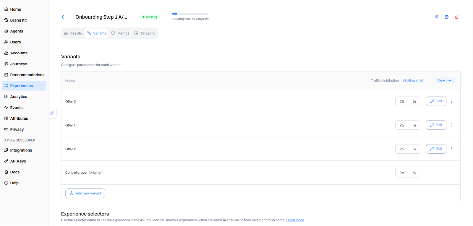
Step 5: Test for incrementality
Clicks can lie; only lift tells you if onboarding actually shortens time-to-value and drives activation.Iterate relentlessly - shipping small changes, measuring downstream behavior, keeping what compounds habit formation.
- Run account-level holdouts (10-20%).
- Primary metrics: Time to value, Day/week activation, multiplayer %, attach rate.
- Secondary: nudge dismissals, time-in-session, and subsequent retention.
Ship 1–2 changes/week, keep a public changelog, sunset what doesn’t move the metric.
Results You Can Aim For
When teams implement the Slack-style flow and measure rigorously, we typically see:
- Time-to-first-value (TTFV): down 40–70%
- Day-1 activation: up 20–35%
- Multiplayer rate (≥2 members/24h): up 25–50%
- Week-1 retention: meaningfully up, often before conversion moves
What Not to Do
- Grand tours that teach everything before doing anything.
- Collecting everything (job title, team size, billing address…) before showing value.
- Triple-nudging (in-app + email + push) for the same action in the same hour.
- Static recommendations that ignore behavior (e.g., keep pushing invites after a user has invited 5 people).
Slack’s onboarding isn’t only “clever copy + great design” It’s a system: fewer choices, clearer defaults, and nudges that appear when they matter. You can ship the same experience - start with a lean activation model, personalize the first session, and test your way into the wins. Check here to get a detailed workflow of how to implement this using Intempt.
TLDR
- Problem: New accounts stall in single-player mode; value is invisible until teammates, channels, and real work show up.
- What Slack nailed: Friction-lite sign-up, personalized empty states, and just-in-time prompts that move users closer to activation.
- How to implement: Instrument a lean activation model, serve in-session next-best actions, use server-side personalizations, reachout on different channels and test for incrementality.
- Impact you can expect: Teams that copy this pattern typically see faster TTV, higher Day-1 activation, and more team activations.
FAQ
Q1: Won’t friction-lite sign-up clash with security?
Split paths. Let end-users start with SSO/lite entry while admins complete SSO/SCIM later. Don’t block the first message behind the enterprise setup.
Q2: How do we avoid annoying nudges?
Use behavior triggers (not timers), add skip to every prompt, cap frequency, and measure dismissals. If a nudge causes immediate exits or muted behavior, retire or retarget it.
Q3. How do we measure onboarding success beyond signups?
Track Activation Rate, Time-to-Value (TTV), step-by-step drop-offs, Day-1/7/30 retention, and RPV for new users.
Q4. How many steps should onboarding have?
As few as needed to reach the first meaningful action; use progressive disclosure for everything else..
Q5. How do we keep advanced users from feeling constrained?
Make everything skippable, let users revisit guides later, and adapt prompts based on experience or role.


Check out Growth Play Library ➡️
Get started free on GrowthOS ➡️
Book a growth call ➡️
.svg)
Sid Chaudhary
Founder & CEO


Looking for ways to grow faster?
Discover marketing workspace where you turn audiences into revenue.
Learn about IntemptReceive Monthly Insights
Get expert insights & news on the latest promotion trends in our monthly newsletter.
Sid Chaudhary
CEO & Founder

Lifecycle automation tips
Industry tips
Case Studies
You might also like...
7 Best Klaviyo Alternatives in 2025: Features, Pricing, and Comparisons
Klaviyo is a proven email and SMS marketing platform - especially for ecommerce brands that live and breathe segmentation, product feeds, and multi-step flows. But many teams tell us they can’t justify the cost, don’t need the full power, or struggle with the learning curve. If you’re wondering whether there are competitors with similar capabilities for less money or tools that feel faster and simpler to run day-to-day, the short answer is yes.
How to Use Product Recommendations That Drive First Purchase
Most first-time visitors are actively comparing, not committing. They bounce between PDPs, size/fit charts, shipping/returns, and discount pages, and leave without giving you an email or cookie you can rely on. Treating your product recommendations as an “afterthought carousel” means you miss the exact micro-moments when guided discovery would tip them into the cart.
7 Best A/B Testing Tools & Software in 2025
A/B testing tools help you validate ideas with real users - so you ship what actually works, not what wins an internal debate. This guide walks through how to pick (and use) the right A/B testing platform for your team.
Subscribe to The Full Stack Marketer 📈
Zero theory or mindset discussions here; just actionable marketing tactics that will grow revenue today.

Web A/B testing
Use front-end A/B and multi-page experimentation product built for any business size. Run multiple experiments on the same page.

Targeting & personalization
Deliver targeted messaging, personalized offers and recommend the most relevant content for your users.

Visual editor
Empower your team to collaborate with an easy-to-use visual editor without using developer time to get things up and running.

Analytics
Gain insight into the impact of your experiments with statistically valid results. No complex statistical analysis required.

Server & client-side testing
Go beyond client-side testing and deploy experiments on the server-side. Test and optimize content changes and even complete re-brands.

Flexible goal selection
Select the right goal for each personalization and experimentation campaign to ensure you’re optimizing towards the right objectives.
.svg)


.svg)
.svg)